
AI Posters That Stay On-Brand
Why every AI-generated class poster looks the same — and the brand sheet and prompts that make yours look like yours.
The good news is it's fixable, and it doesn't take a designer. It takes about ten minutes with ChatGPT asking you the right questions, and then you reuse what comes out of it forever. Here's exactly how I do it, step by step, with the real prompts I use.
Learn to spot the AI look
Most instructors' first instinct is to paste their hex codes into the prompt. Good instinct, but it doesn't work on its own. I did it for months and the posts still looked AI-made, just in navy instead of purple.
That's because the tells aren't in the palette. They're in the composition and the surface. Once you know them you can't unsee them:
- The coloured strip down the left edge — a vertical accent bar that no human designer asked for.
- The brush stroke — a painterly swoosh behind or under the headline, usually in an accent colour.
- Fake depth — a gradient in the background, a soft glow behind the text, a drop shadow on everything.
- Everything centred — headline centred, subhead centred, details centred, generous symmetrical margins. Safe and forgettable.
- Decorative filler — little sparkles, dots, corner flourishes, abstract shapes drifting in the background.
- Stock-perfect people — a glossy, evenly-lit woman mid-stretch who has never been to your hall in Dunmanway.
- Letters that are nearly right — the headline reads fine at a glance and falls apart when you look twice.
Here's what I got when I typed what most of us type:
Make me an Instagram post for my new DanceFit class
starting in September.
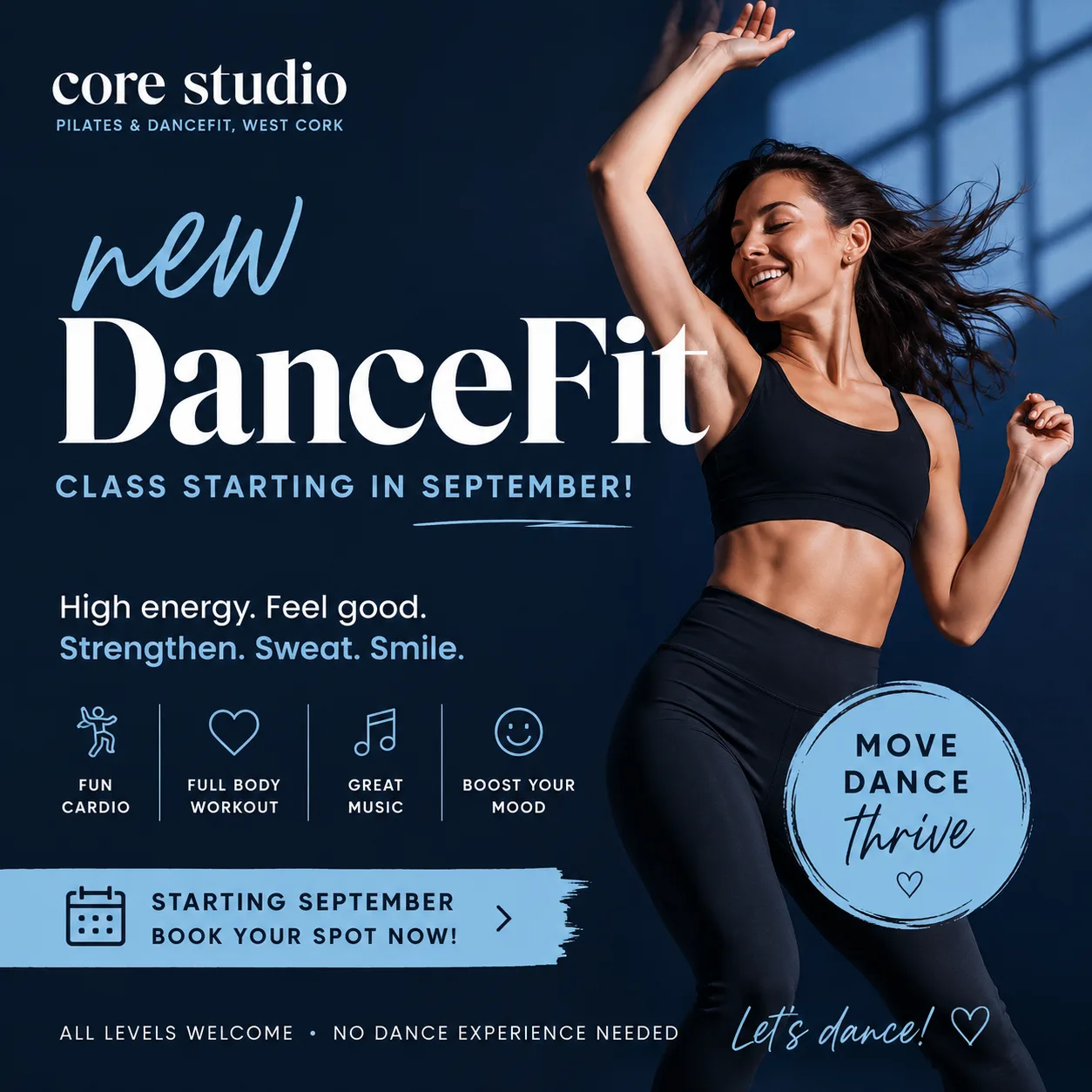
It's competent, and it's every habit from the list above in one image: a stock photograph of a woman mid-jump, a brush stroke behind the call to action, a glow around the headline, a script font doing the work of "friendly", a row of icons nobody asked for, a badge in the corner.
The part that surprised me is that it's already in my colours. ChatGPT knew them, so it gave me navy and sky blue, my wordmark, "Pilates & DanceFit, West Cork" along the top. And it still isn't mine. Cover the wordmark with your thumb and it could be any studio in any town. The brand isn't the palette. It's the layout, the type, the flatness or the texture, the amount of empty space, and — just as importantly — the things you never do.
Build your brand sheet with ChatGPT
AI can't look at your Instagram and absorb the vibe. It needs instructions. So the fix is a brand sheet: your brand written down as a short spec — one screen of text, no more — that you paste at the top of every prompt.
Four things make it work:
- Colours with jobs. Not "my colours are navy and blue" but "the background is always #1E293B, the type is always white". Give each colour a role or the AI will swap them around.
- Type with weight, case and alignment. Font name alone isn't enough — say bold, say all-caps or sentence case, say left-aligned.
- A layout rule. Where the headline sits, where the details sit, how much of the square the headline should fill.
- A ban list. This is the part everyone skips and it's the part that does the work. Name the AI habits from step one and forbid them explicitly.
You don't have to write it from a blank page. Take screenshots of three to five of your own posts that you're proud of, attach them to a new ChatGPT chat, and paste this in. It will study the screenshots, tell you what it sees, then interview you to fill in the gaps. No screenshots yet? Send the prompt on its own and it will start from scratch.
I run a small fitness studio and I want a one-page "brand sheet" I can
paste into future prompts so the Instagram posters you make for me look
like my brand, not generic AI design.

I've attached [3–5 screenshots of my own posts / my logo] — or, if
nothing is attached, I'm starting from scratch.

If I attached images: study them first and tell me what you see —
the exact colours (as hex codes), the type style, where text sits, and
what is never there. Then ask me to confirm or correct it.

Then interview me to fill any gaps. Ask ONE question at a time, give me
2–4 concrete options to pick from where you can, and keep it to about
eight questions. Cover:
- colours, and the job each one does (background, headline, accent)
- headline type: weight, case and alignment, described in plain words
- where the headline, class details and logo sit on a square post
- three words for the tone
- what I never want to see

Assume I want to avoid the usual AI-poster habits unless I say
otherwise: gradients, glows, drop shadows, brush strokes, sparkles,
stock photos of people, rows of icons, badges, centred text, and
script or fancy serif fonts.

When we're done, write the brand sheet in exactly this format, under
one screen long, and nothing else:

BRAND:
Colours (with jobs):
Type:
Layout:
Tone:
Never use:
Prefer to fill it in yourself? Here's the blank:
BRAND: [your studio name]

Colours (with jobs):
- Background: [hex]
- Headline type: [hex]
- Accent, used sparingly for [what]: [hex]

Type:
- Headline: [font], [weight], [ALL CAPS / Sentence case], [alignment]
- Details: [font], [weight], [alignment]

Layout:
- Format: [square 1:1 / portrait 4:5]
- Headline sits [where] and fills about [x]% of the square
- Class details sit [where], small
- Wordmark [where]

Tone: [three adjectives]

Never use:
- [your ban list]
Either way, keep the finished sheet somewhere you can grab it in two seconds. Better still, paste it into a Claude Project or a ChatGPT custom instruction so it's applied every time without you thinking about it.
Check it against a finished one
Here's mine, so you can see how specific it needs to be. My posts are big flat blocks of colour with heavy white writing across them — that's it. No photos, no shapes, no texture. It's not sophisticated, but it's mine: people in Clonakilty know a Core Studio post before they read a word of it.
BRAND: core studio — Pilates & DanceFit, West Cork

Colours (with jobs):
- Background: solid #1E293B (deep navy) OR solid #38BDF8 (sky blue).
  One flat colour, edge to edge. Never both in the same poster.
- Headline type: #F1F5F9 (off-white). Always.
- No third colour.

Type:
- Headline: Archivo Black — a heavy, bold sans-serif with no
  serifs, ALL CAPS, tight letter spacing, left-aligned
- Details: DM Sans, regular, left-aligned, small
- Wordmark "core studio" always lowercase
- No serif or script fonts anywhere

Layout:
- Square 1:1
- Headline in the upper-left, three or four words max,
  filling about 60% of the square
- Class details in a single small block in the bottom-left
- Wordmark bottom-right, small
- Wide, uneven margins — more space at the bottom than the top

Tone: warm, direct, unfussy

Never use:
- gradients, glows, drop shadows or any faux 3D
- brush strokes, swooshes, splatters or painterly effects
- a vertical coloured bar down any edge
- sparkles, dots, corner flourishes or abstract background shapes
- photographs or illustrations of people
- centred text
- more than one colour behind the type
- serif, script or handwritten fonts
If yours is vaguer than this — "modern font", "nice and clean", "bright colours" — go back to ChatGPT and push for specifics. Every vague line is a gap the AI will fill with its own defaults, and its defaults are the look you're trying to get away from.
Prompt with the sheet attached
Now the same ask as step one, with the brand sheet attached. The structure is: brand sheet, then the copy for this specific poster, then the ban list restated at the end because that's where it sticks.
Design a square Instagram poster for my class. Follow this
brand sheet exactly — it is not a suggestion.

[paste your brand sheet here]

This poster:
- Background: solid #38BDF8
- Headline: DANCEFIT IS BACK
- Details block, exactly this text on four lines:
  Thursdays 7.15pm
  Cox's Hall, Dunmanway
  6 week term from 17th September
  €48 for the term
- Wordmark: core studio

Flat colour only. No gradient, no shadow, no glow, no brush
stroke, no shapes, no people, no sparkles, nothing centred.
Headline in a heavy bold sans-serif — no serifs.
If you are tempted to add a decorative element, leave it out.
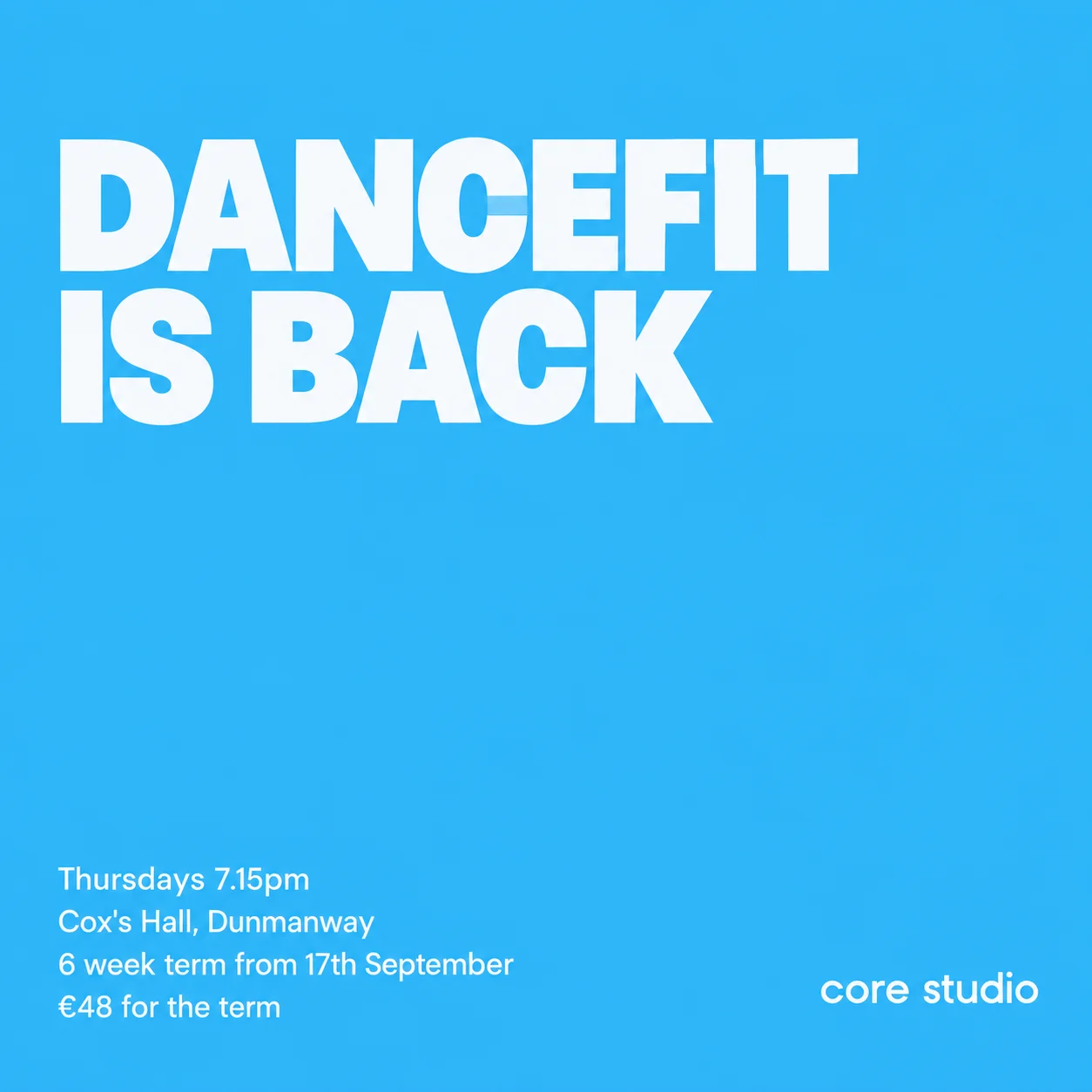
Everything structural came through: flat colour edge to edge, a heavy headline upper-left, details bottom-left, wordmark bottom-right, nothing centred, nothing decorative, and a lot of empty blue. One honest caveat: image models approximate type rather than set it, so treat the font line in your brand sheet as a strong steer and not a guarantee. If the exact typeface matters to you, have the AI make the flat background and set the headline yourself in Canva.
The last line of the prompt does more than it looks like it should. AI wants to fill space — it treats empty space as an unfinished job. Telling it in plain words that the emptiness is the point is what gets you a poster with confidence in it.
Fix one thing at a time
The first attempt is rarely right. Don't re-roll the whole thing hoping for luck — say what's wrong in one short sentence and ask for that one change. These are the follow-ups I use constantly:
- "Flatten it. Remove every gradient, shadow and glow — one solid colour edge to edge."
- "The headline is too small. It should fill about 60% of the square."
- "Delete the decorative shapes in the background. Leave that space empty."
- "Left-align everything. Nothing centred."
- "The venue name is misspelled — it's Cox's Hall. Regenerate with the text exactly as written."
- "Keep this composition exactly, change the background to #1E293B."
That last one is how you get a set. Once you've got one poster you're happy with, ask for the same layout with different copy and the other background colour, and suddenly your feed looks planned instead of assembled week by week.
The five-second test
Before you post anything, cover the wordmark with your thumb and look at it for five seconds, the way someone scrolling actually would. Then ask: would one of my regulars know this was me?
If the answer is no, the poster isn't finished — and it doesn't matter how nice it looks. A beautiful post nobody attributes to you is an advert for AI, not for your Thursday class. It's a blunt test and I fail it more often than I'd like, but it's saved me from posting a lot of very polished nothing.
Stop retyping your class details
One more thing that has quietly saved me a lot of hassle. Half the effort in a poster prompt is the boring half — the day, the time, the venue, the term dates, the price, whether there are spaces left. I used to type those from memory and I got them wrong often enough to be embarrassing.
StudioFlow connects directly to Claude and ChatGPT through MCP, so the assistant can read my actual schedule. I say "make me a poster for Thursday's DanceFit in Dunmanway, using my brand sheet" and it pulls the time, the venue, the term start and the number of spaces left straight out of my classes. No copy-paste, and no poster advertising a class that filled up last week.
The AI does the part I'm bad at. The brand sheet keeps it sounding like me. That's the whole trick — your brand still has to exist before you can hand it over.